
Well, designers always say it’s hardest to design for yourself… and now I know how true that statement really is! Today I’m unveiling a brand update for my own business, and I wanted to share a little bit about the process and the reasons why I decided to make a shift.
Let’s start with the why—because I believe every good design begins with a why. There must be a purpose behind an effective design.
I’m always making little updates to my site and my collateral materials… trying to make each touchpoint of my brand an intentional experience for my potential clients.
Over the past few months (and even years), my brand elements have gradually evolved: a new font implemented here and there, a tweaked color palette, or updated brand imagery to elevate my website. I was happy with the changes overall, but there was one design element that didn’t feel aligned with my evolved brand: the logo.
My previous logo was my original one: the first graphic to ever represent my business. Like many of my clients, I felt a sentimental attachment to the design that had helped me launch my business and grow into a successful brand.
But here’s the thing: that logo was crafted with its own set of communicative intentions.
I designed that logo during college: when I wasn’t sure what I was going to do or where my career might lead me. At the time, I was considering offers from big advertising agencies and smaller design teams, while doing one-off calligraphy projects as a side hustle. I didn’t know if this design would just be a header on my resume, or a logo for a real business. My portfolio included ad concepts, illustrations, typographic designs, and spot calligraphy pieces.
At that time, I needed a logo that could speak to any of those skillsets… a design that could represent me to a big agency just as well as a small one; a design that could convey both my typographic and calligraphic skills, with an illustrative feel. It felt playful and welcoming: a design that said, “Hire me! I can (and will) do anything!”
Since then, my message has changed.
I’m no longer trying to appeal to a wide variety of audiences. I don’t need to attract small lettering / illustration projects or catch a creative director’s eye. I only need to speak to the clients that I now know I love working with: creative entrepreneurs who are ready to elevate their own businesses with intentional and polished design.
Of course, my skillset has also evolved—and along with that, I’ve elevated my client experience. As the value I can offer has increased, my prices have also increased. (Looking to elevate your own services? Download the freebie here!) I needed a logo design that could directly appeal to higher-end client and speak to the polished experience I now provide.
So, what about the new look?
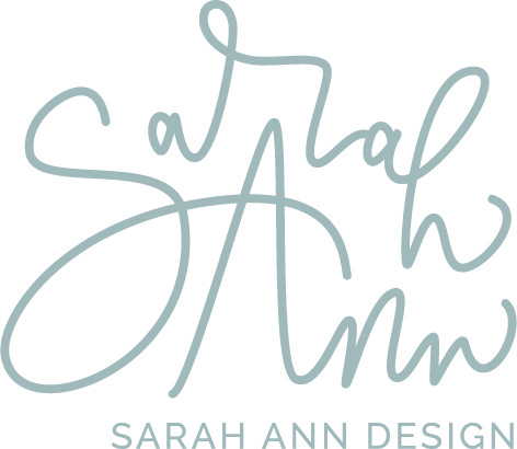
It still has a loose and whimsical quality to it—but in a more refined way. I toned down the playfulness in favor of a more stately feel. It speaks to a more mature audience—which is exactly what I needed it to do.
I also added a submark: a crest with personal symbolism behind it. Each element is a representation of personal values, from the lilies and knots to a regal crown. And of course… I couldn’t make a brand update without including Mia! 🐶
Confession: before this brand update, I’d never had any logo variations or submarks at all! I usually provide so many variations to my clients… but I’d neglected to create any for myself. With this new look, I’m loving the variety of design elements I can incorporate into my website and collateral pieces.
Take a look and let me know what you think! I’d love to hear your thoughts and feedback.
And if you’re thinking of investing in a rebrand of your own… please know that I give just as much thought and consideration to your design as if it were my own. It is such an honor to be entrusted with your brand. It’s a privilege that I don’t take lightly… and a real joy to see the tangible impact it can have on your growth.
*This page may contain affiliate links to trusted products and services. Sarah Ann Design may earn a small commission if you choose to make a purchase from one of our partners. We partner with brands we trust, and share our honest opinions.
Learn how to drive traffic to your website via Pinterest marketing: leverage your evergreen content with Pinterest strategy.

How to Drive Traffic with Pinterest
read the post
Build creative confidence, acceptance, gratitude, and self-love with these 23 affirmations for creatives. (I say these words to myself every day.)

23 Daily Affirmations for Creatives
read the post
Is Honeybook right for you and your design business? Read this post to learn about my client process, and the features I recommend for designers!

Honeybook Workflow for Designers
read the post
Resources for Creatives
Resources for Creatives
Resources for Designers
This year, we're focusing on the word well: living well, doing business well, and serving our clients well. Learn more about our vision here.

Choosing to Live Well
read the post
This free resource will give you a foundation to polished typographic design… allowing you to build a thriving design career.

The Typography Handbook
read the post
How to set healthy boundaries that show respect for your clients and for yourself, allowing you to be fully present for work, life, and rest.

How to Set Healthy Boundaries
read the post
Resources for Creatives
Resources for Designers
Resources for Creatives
I am a big proponent of continued education in your chosen field—especially by reading! This essential reading list is a peek into my bookshelf.

Reading List for Creatives
read the post
Learn how to build your email list with effective, high-converting opt-ins. Build an engaged list and connect with your audience.

How to Build Your Email List
read the post
Planning a photo shoot to capture brand images and headshots for your website? Read these tips from a professional web designer first!

Brand Photography Tips
read the post
Resources for Creatives
Resources for Creatives
Resources for Creatives
Read this post for 3 easy ways you can connect with your ideal client. This simple checklist will help you establish that connection and create conversion!

3 Ways to Reach Your Ideal Client
read the post
As a graphic designer or freelancer, a professional contract is the best way to set expectations for both yourself and your clients.

How to Legally Protect Your Business
read the post
I'm so honored to be featured on Shanna Skidmore's "Consider the Wildflowers" podcast. Join our conversation in episode 041.

Podcast Feature
read the post
Resources for Creatives
Resources for Designers
Resources for Creatives
How do you cultivate creativity in your daily workflow? Are you finding time to nurture your creative spirit? Visit this list for ideas!

How to Stay Creatively Inspired
read the post
Commit to starting your day with 5 morning routine habits that will open your heart to gratitude, creativity, and inspiration.

5 Morning Routine Habits
read the post
Instagram is one piece of the marketing funnel—but it's not the end goal. Your website is the place where inquiries turn into booked clients.

Instagram is Not Your Portfolio
read the post
Resources for Designers
Resources for Creatives
Resources for Creatives


